


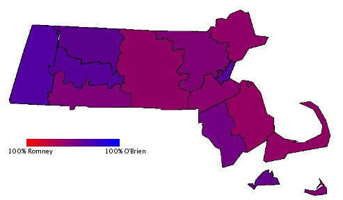
Last year, in one of my first blog posts ever, I created a map showing the results of the 2002 election by county. I colored it so that each county was a shade of purple that corresponded with the gubernatorial vote percentages in that county. A county that went for Shannon O'Brien (the Democrat) would be more blue, and a county that went for Mitt Romney (the Republican) would be more red. I had wanted to compare these results with those from 1998, but eventually I forgot about the project and moved on to other things. Over my vacation, I finally got a chance to put the map together. Here is the 1998 election map by county, in the style of the purple America map.
Harshbarger vs. Cellucci 1998
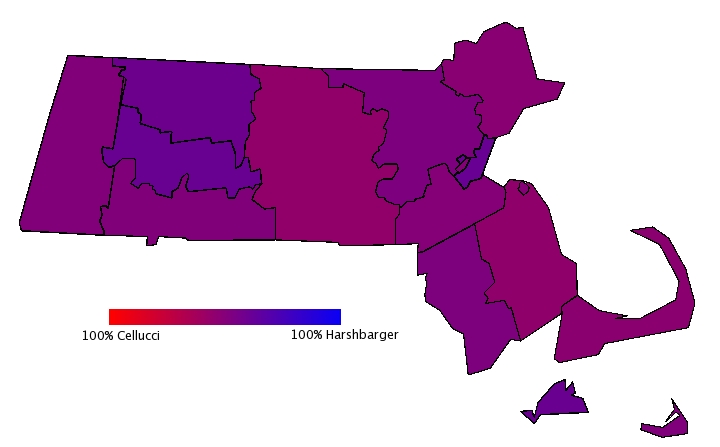
The map is a little blurry, but if you click on the full version, you can see that it looks very similar to the 2002 map except in 2002 Berkshire and Suffolk counties are noticeably bluer. Still, the differences are hard to see using this style of map. To make things clearer, I took the difference in votes from 1998 to 2002 for both the Republican candidate (Paul Cellucci in '98, Mitt Romney in '02) and the Democratic candidate (Scott Harshbarger in '98, Shannon O'Brien in '02) and put them in the following chart:
| County | GOP Increase | Dem Increase |
| Barnstable | 13.37% | -1.54% |
| Berkshire | -32.80% | 37.62% |
| Bristol | 2.86% | 16.02% |
| Dukes | 6.67% | 3.89% |
| Essex | 19.73% | 1.35% |
| Franklin | -5.07% | 12.22% |
| Hampden | 12.98% | 13.93% |
| Hampshire | -4.58% | 20.10% |
| Middlesex | 16.34% | 4.15% |
| Nantucket | 12.48% | 3.87% |
| Norfolk | 16.33% | 2.99% |
| Plymouth | 23.42% | 10.84% |
| Suffolk | 3.83% | 26.77% |
| Worcester | 11.40% | 9.37% |
| Total | 12.91% | 9.33% |
How much of the increase in turn out can be explained by increased partisan voter registration during that time? By way of comparison, the number of registered Republicans increased by 9.17% from 1998 to 2002 while the number of registered Democrats increased by only 3.94%. That's a little misleading because there are so many more registered Democrats in Massachusetts than Republicans. Despite the difference in percentage gain, the Democrats actually registered over 10,000 more people than the GOP in those four years. That said, both parties increased their vote totals by more than increased voter registration explains.
What can we take away from this? First is that, though Shannon O'Brien's percentage of the vote was lower than Scott Harshbarger's, she actually did better than he did in terms of vote totals. In fact, O'Brien actually would have beaten Paul Cellucci if you match her numbers from 2002 with his from 1998. That makes sense given the Democrats' higher turnout in '02, but you can really see how the increased Republican turnout effected the race. A greater percentage of Republicans turned out in 2002 than in 1998, and the Republican precentage change reflects that. The Dems are on the right track this year with their Victory 06 campaign. The winner in 2006 won't be the one who switches the most votes from the other party, but the one who's able to grow their vote total by bringing in people who are not regular voters.
|